Thursday 5 May 2016

Lab 8: Spectral Signature Analysis & Resource Monitoring

Goals and Background: 

The main goal of this lab is for you to gain experience on the measurement and interpretation of spectral reflectance (signatures) of various Earth surface and near surface materials captured by satellite images and also to perform basic monitoring of Earth resources using remote sensing band ratio techniques. In this lab, you will learn how to collect spectral signatures from remotely sensed images, graph them, and perform analysis on them to verify whether they pass the spectral separability test discussed in lectures. This is a prerequisite for image classification which will be cover in the advanced version of this class. Also you will monitor the health of vegetation and soils using simple band ratio techniques. At the end of this lab, students will be able to collect and properly analyze spectral signature curves for various Earth surface and near surface features for any multispectral remotely sensed image and also monitor the health of vegetation and soils.

Methods:

Spectral signature analysis

A spectral signature is a graphical representation of the spectral response of a certain type of feature or object as a function of wavelength. Basically, a spectral signature indicates which bands are reflected the most in a surface feature.

The spectral signatures analyzed in this lab are as follows:


1. Standing Water
2. Moving water
3. Vegetation
4. Riparian vegetation.
5. Crops
6. Urban Grass
7. Dry soil (uncultivated)
8. Moist soil (uncultivated)
9. Rock
10. Asphalt highway
11. Airport runway
12. Concrete surface (Parking lot)

In order to capture the spectral signatures, the surface feature was found on the imagery and a polygon (found under the drawing toolbar) was created (figure 1).

Figure 1. Capturing Lake Wissota's spectral signature by creating a polygon on the surface feature.
The spectral signature window was accessed through the Raster tab and then Supervised  and Signature Editor. After the window was opened, the new signature was added to the table (figure 2). Sometimes, it was difficult to discern the individual features on the false color imagery, so Google Earth was linked to ERDAS, which made determining features much easier.

Figure 2. All 12 of spectral signatures added in the Signature Editor table. Statistics could also be viewed from this window.
Spectral signatures are useful in being able to detect differences between surface features, such as dry and moist soil. Although they are very similar surface features, their moisture content determines reflectivity, and ultimately the spectral signature of the soils (figure 3).
Figure 3. Spectral signatures of dry soil and moist soil. Moisture content is one of the main determinants of spectral signature in soil. The higher the moisture content, the lower the reflectance. This is 'reflected' in the spectral signature of water, which has low reflectance comparatively to other signatures. 

Resource monitoring

Resource monitoring is an extremely practical use of remote sensing, and is of great interest to many people, including farmers and urban planners. Using remote sensing for these types of applications is much less expensive and convenient than individually examining plants or soil for health of resources. In this lab we will examine two of the many calculations that can easily be done in ERDAS: NDVI and FM.

Normalized difference vegetation index (NDVI) is used to determine vegetation abundance in imagery. The equation for this calculation is NDVI = (NIR-Red)/(NIR + Red) where NIR is near infrared and Red is the red band (band 3). In ERDAS, this calculation can be done simply by accessing the Raster tab, then Unsupervised, then NDVI.

Detecting ferrous minerals (FM) is important in examining the health of soil, and for agricultural regions, crop fields. The equation for calculating FM = MIR/NIR, where MIR is middle infrared and NIR is near infrared. In ERDAS, this calculation can be done simply by accessing the Raster tab, then Unsupervised, then Indices, then select the ferrous mineral option from the index dropdown.

Results:

The running list of all 12 spectral signatures created above were added to the Spectral Signature window, and a graph could be created to analyze the differences between the feature's signatures. Below depicts the spectral signatures and how they coincide with one another (figure 4).
Figure 4. Spectral signatures. The y-axis highlights the percentage of reflectance and the x-axis depicts the bands at each tick mark (e.g Band 1 = 1 etc).
After using the NDVI calculator, the displayed image in ERDAS was black and white, not so exciting or helpful, so ArcMap was used to classify discrete values and create an informative map of Eau Claire and Chippewa counties (figure 5).

Figure 5. NDVI map of Eau Claire and Chippewa Counties in 2000.

Similar to the NDVI, the FM calculator was utilized and the imagery was brought into ArcMap to be displayed in a cartographically pleasing manner. Maps like this can be very useful for farmers who are curious of the iron content of their soil (figure 6).

Figure 6. Ferrous Mineral Content of Eau Claire and Chippewa Counties in 2000.


Conclusion:

I really loved doing this lab. We have been talking about reflectance throughout the semester, and creating our own spectral signatures was in a very nerdy way, quite rewarding. Understanding spectral signatures is vital in being able to effectively identify vegetation types. Doing this lab has also given me a new appreciation for landcover identification. I also really enjoyed calculating NDVI and ferrous minerals. Although this lab is relatively simple compared to orthorectification, learning these tools will help immensely in the future.

Source:

Satellite image is from Earth Resources Observation and Science Center, United States Geological Survey.

Tuesday 3 May 2016

Lab 7: Photogrammetry

Goals and Background:

The main goal of this lab exercise is to develop skills in performing key photogrammetric tasks on aerial photos and satellite images. Specifically, the lab is designed to aid in understanding the mathematics behind the calculation of photographic scales, measurements of areas and perimeters of features, and calculating relief displacement. Moreover, this lab is intended as an introduction to stereoscopy and performing orthorectification on satellite images. At the end of this lab exercise, students will be in a position to perform diverse photogrammetric tasks.

Methods

Scales Measurements and Relief Displacement

Calculating scale of nearly vertical aerial photographs

Although it may seem simple, it is extremely important to calculate real world distances on imagery. This gives more context as to the relationship between features and the imagery itself. Calculations can be done in multiple ways. One calculation is using the distance on the photo as well as the real world distance between points. The calculation can be seen below.

S= pd/gd

Where:
S = scale
pd = photo distance
gd = ground distance

The initial equation was S = 2.7" / 8822.47'. 2.7" is the distance from point A to point B on the image and 8822.47' is the real world ground distance (which was provided by Dr. Cyril Wilson). A calculation was required to convert the feet to inches to be in the same units. This produced the converted equation: 2.7" / 105,869.64". In order to produce the equation in the form of scale, the numerator needed to become '1' so the numerator and denominator were divided by 2.4". This produced the equation (2.7" / 2.7") / (105,869.64" /2.7") which gives us the scale of 1: 39,210.97 (figure 1).

Figure 1. The image used to find the distance between point A and point B. The actual scale of the imagery was found to be 1:39,210.97 which was found by using the real world ground distance as well as the distance on the image.
Sometimes it is not possible to have a real world distance provided for a calculation, so a different equation can be used. This equation requires the person doing the calculations to know the focal lens length of the camera used to shoot the imagery as well as the altitude above sea level (ASL)and elevation of the terrain. The focal lens length for this image is 152 mm, the ASL is 20,000 feet, and the elevation of terrain is 796 feet. Below is the equation that was used:

S = f/ (H-h)

Where:
S = scale
f = focal lens length
H = altitude above sea level (ASL)
h = elevation of terrain


The initial equation (with numbers plugged in) was 152 mm / (20,000' -796'). Again, there needed to be a conversion done, so the feet in the denominator were converted to mm. That resulted in the equation 153 mm / 5853379.2 mm. The numerator needed to be '1' again in order to obtain the scale of the imagery. The equation was then (152 mm / 152 mm) / (5853379.2 / 152) which resulted in the scale of 1: 38509.

Measurement of areas of features on aerial photographs

In addition to using the above methods to determine scale. Individual features can also be determined by using the measurement tool in ERDAS Imagine. The area the user wants to measure can be digitized using with the polygon shape.In the case of this lab, a lake was digitized, which can be seen below (figure 2).  After 'closing' the shape, a perimeter and area appear at the bottom of the imagery (figure 3).

Figure 2. In order to determine the perimeter and area of the lake, the measurement tool was used to digitize a polygon around the edge of the water body.
Figure 3. Perimeter and area displayed after digitizing the lake in figure _.
The principal point is the optical center of an aerial photo.

To calculate relief displacement, the following equation must be used:
D = (h * r)/ H

Where:
D = relief displacement
h = height of object (real world)
r = radial distance of top of displaced object from principal point (photo)
H = height of camera above local datum

Calculating relief displacement from object height
Relief displacement is the displacement of objects and features on an aerial photograph from their true planimetric location on the ground. All objects above and below the found in all uncorrected imagery. All points collected away from the principal point will have some distortion because the imagery is being collected at an angle (figure 4).


Figure 4. Every feature collected from the sensor, except the point taken at the principal point has some displacement. This distorts how the image appears on the imagery. The above graphic illustrates how features are displaced at box 'A'. The feature appears to be leaning toward the principal point.

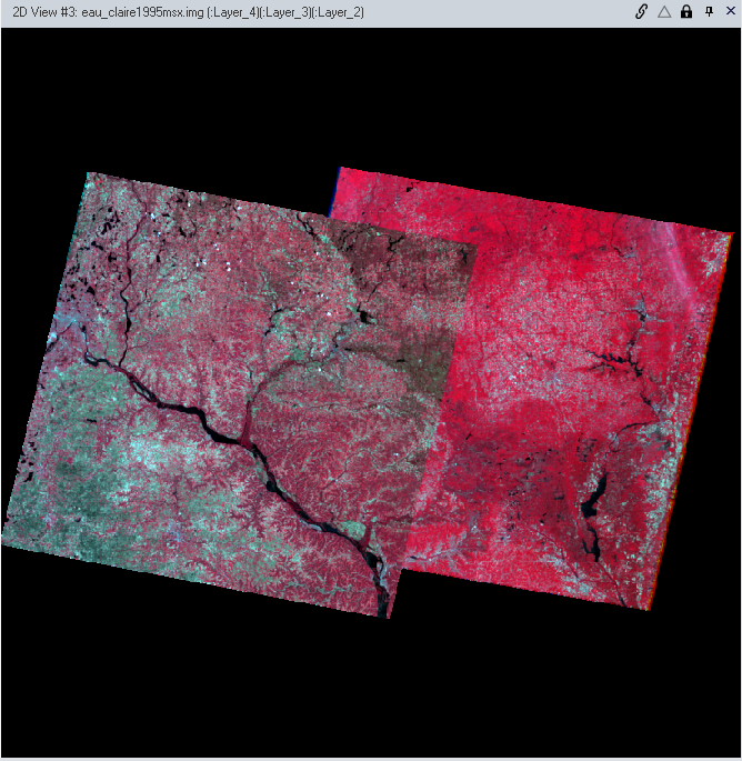
Below is a real world example taken in Eau Claire of imagery with relief displacement (figure 5).

Figure 5. The principal point is located at the top left portion of the imagery. Notice the tower, indicated in the upper right portion of the imager. If there was no displacement you would not see the side profile of the tower, rather, it would appear as a circle (which would just show the top).
Below is an example of the relief displaced tower (left) and the corrected tower (right) (figure 6).

Figure 6. Note the difference between the towers in the images. The one of the left's side profile can be seen where as the tower in the right image only appears as a circle, indicating that the right image's relief displacement has been corrected.  

Stereoscopy

Anaglyphs are stereoscopic photos that contain two images that overlap and are printed in different colors. With 3D glasses (that contain a red and blue filter in their respective lenses), anaglyphs appear to be 3D. Anaglyphs can be used in remote sensing to better understand to topography of an area.

 Creation of anaglyph image with the use of a digital elevation model (DEM)

To create an anaglyph, the Terrain tab was activated and the Anaglyph button was pressed. From here, a DEM and regular aerial imagery were applied to the inputs. The exaggeration for this anaglyph was 1, which means that no exaggeration was applied to the image. The output image for this is seen in the results section (figure 12).

Creation of anaglyph image with the use of a LiDAR derived surface model (DSM)

Similar to the above anaglyph creation with the DEM, a DSM anaglyph was also generated. Figure _ below illustrates the DSM anaglyph next to the DSM imagery from which the output anaglyph was derived. The areas that 'pop' the most on the DSM imagery are the locations where there are changes in the DSM (figure 7). The output image for this is seen in the results section (figure 13).

Figure 7. Digital surface model (DSM) (left) in comparison to the ec_quad anaglyph (right).

Orthorectification

Orthorectification is a complicated process whose purpose is to simultaneously remove positional and elevation errors from one or more aerial photos or satellite image scenes. This involves obtaining real world x,y, and z coordinates of pixels for aerial photos and images. Ultimately these images can be used to create orthophotos, stereopairs, and DEMs to name a few. Important elements of orthorectification include the pixel coordinate system, image coordinate system, image space coordinate system, and ground coordinate system.

This section of the lab, we will utilize the ERDAS Image Lecia Photogrammetric Suite (LPS) which is used in digital photgrammetry for triangulation, orthorectification of images collected by various sensors, extraction of digital surface and elevation models etc. A planimetrically true orthoimage will be created using LPS in this section.

A New Block File was created in the Imagine Photogrammetry Project Manager window. The Polynomial-based Pushbroom was selected as the geometric model. The projections for the horizontal and vertical reference coordinate system were set to UTM, the Clarke 1866 spheroid was chosen, and NAD27(CONTUS) was chose as the datum. The parameters of the SPOT Pushbroom were then established to enable the next step of the orthorectification process (although the default parameters were used).

The point measurement tool was activated (specifically the Classic Point Measurement tool) and the GCPs could then be collected. The GCP locations were based on the locations provided by Dr. Cyril Wilson (figure 8). After 2 points were collected, the Automatic (x,y) Drive icon could be utilized. This feature can only be used after 2 GCPs are established. This feature speeds up the process of collecting GCPs, which was highly appreciated during this marathon lab. 9 GCPs were collected in total. The last two GCPs were collected using NAPP_2m-ortho.img. The spatial resolution of the orthoimage was 2 meters. The GCPs were collected on the point measurement box, which could be viewed after the GCPs were collected (figure 9).

Figure 8. Process of GCPs being collected for orthorectification. The reference image is on the left and the uncorrected image is on the right.
Figure 9. Point measurement box which indicates the GCP points collected on the imagery.
In addition to a horizontal reference, a vertical reference needed to be established used a DEM. A DEM was selected as the reference and the z values were selected to establish the z values.

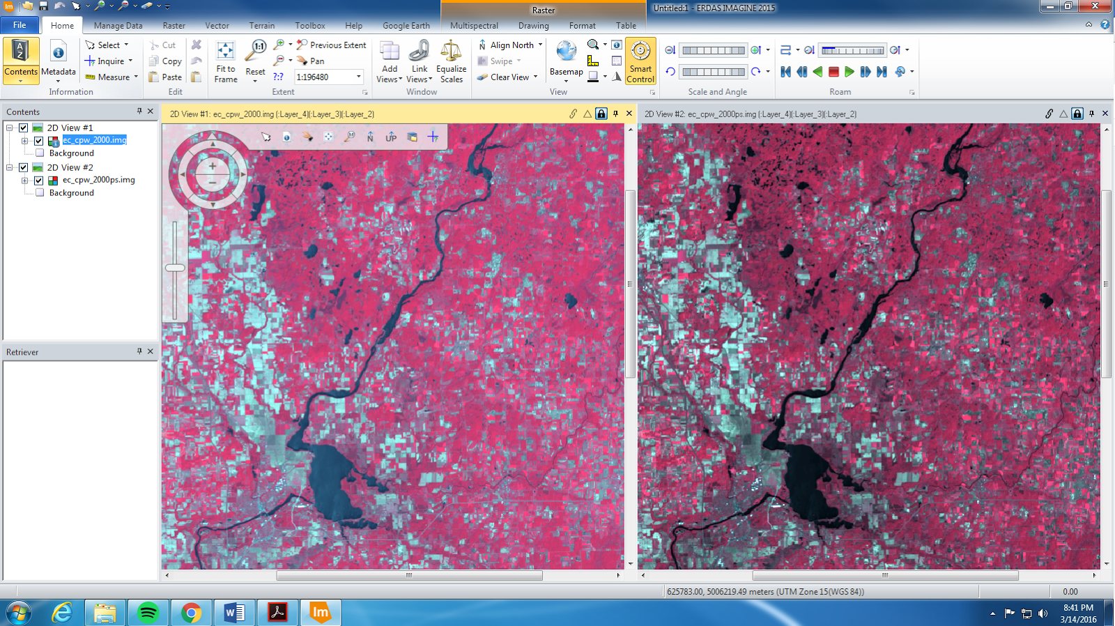
The next step was adding a viewer to the GCP window, which then added Spot Pan B to the Spot Pan imagery. Spot Pan was used as a reference for the Spot Pan B imagery. Another set of GCPs were collected to correct the second image, Spot Pan B (figure 10). After the regular GCPs were collected, Automatic Tie Point Generation Properties feature was run. Tie points are points whose ground coordinates are unknown but are visually recognizable in the overlap areas between two or more images. The ouput Auto Tie Summary was analyzed for accuracy. The accuracy was high so no further adjusting was needed.


Figure 10. GCP collection for Spot Pan B.
The Triangulation tool was then run using the Iterations with Relaxation set at 3 and the Image Coordinate Units for Report is set to Pixels. Under the Point tab, the Same as Weighted Values type was selected and the X,Y, and Z values were all set to 15 meters (figure 11). The accuracy was measured and an output report was created which included the Root Mean Square Error.


Figure 11. Post triangulation. The triangles are GCPs and the squares are the tie points. The green and red rectangles at the bottom indicate how close the process of orthorectification is to being completed. 
The finishing touch of the lab was running the Ortho Resampling Process. The DEM that was used previously was used as an input. The resampling that was selected was Bilinear Interpolation. The second image was also added via the Add Single Output window. And ta-da, there you have it, orthorectification!


Results:

To be able to see the anaglyphs in their full glory, you will need to use 3D glasses. The below anaglyphs produced very different output images. Through my eyes, the anaglyph created using the DEM (figure 12) was much more difficult to see the changes in 3D than in the DSM (figure 13). This is likely the case because the DSM had 2 meter resolution whereas the DEM had 10 meter resolution. I also believe this is because the DEM highlights smaller features such as buildings etc, whereas the DSM highlights larger surface features such as the elevation changes from terra_. The coloration of the images could also play a role in the extent of the ability to view the anaglyphs in 3D; the DSM is brighter and it is easier to tell without using the glasses that the imagery is supposed to be '3D'.

Figure 12. Anaglyph using DEM

Figure 13. Anaglyph using DSM.
The tedious process of using GCPs, tie points, triangulation, and the other functions to obtain the final output orthorectified image is complete (figure 14). The images overlap perfectly with each other to produce two images that are seamless (figure 15) and completely correct in it's X, Y, and Z coordinates.

Figure 14. Overlap of both orthographic pan images (Pan and PanB).


Figure 15. This figure indicates the boundary (see diagonally) between the two orthographed images. Aside for the variation in brightness values, the images are matched up perfectly.
Conclusion:

There are quite a few ways in which there can be errors in imagery. It is important to take the time, as painstaking as it can be, to correct these errors in order to be able to properly analyze the images. Although this was a 'marathon' of a lab, I really liked having to use the GCPs to correct the images. Seeing 6 windows on the GCP Reference Source dialog can be extremely daunting, but I'm glad I was able to experience it by having well thought out directions before I get into the real world.

Sources: 

National Agriculture Imagery Program (NAIP) images are from United States Department of
Agriculture, 2005.

Digital Elevation Model (DEM) for Eau Claire, WI is from United States Department of
Agriculture Natural Resources Conservation Service, 2010.

Lidar-derived surface model (DSM) for sections of Eau Claire and Chippewa are from Eau
Claire County and Chippewa County governments respectively.

Spot satellite images are from Erdas Imagine, 2009.

Digital elevation model (DEM) for Palm Spring, CA is from Erdas Imagine, 2009.

National Aerial Photography Program (NAPP) 2 meter images are from Erdas Imagine, 2009.

Wednesday 20 April 2016

Lab 6: Geometric Correction

Goals and Background:

This lab is designed to introduce you to a very important image preprocessing exercise known as geometric correction. This lab is structured to develop your skills on the two major types of geometric correction (image to map rectification and image to image registration) that are normally performed on satellite images as part of the preprocessing activities prior to the extraction of biophysical and sociocultural information from satellite images.

Methods:

Image-to-map rectification

This geometric correction uses a map coordinate system to rectify/transform the image data pixel coordinates. This particular imagery is from Chicago, Illinois. In order to rectify the images, one needs to access the Ground Control Points (GCPs) via the Multispectral tab, then Control Points, Select Geometric Model, then Polynomial. The first order polynomial transformation was the model used for this image-to-map-rectification. With the 1st order, only 3 GCPs are required. However, these points need to be spread throughout the image to most accurately adjust the incorrect image (figure 1). It is best to place the GCPs in areas on the imagery that can be easily recognizable, such as an intersection. While placing the GCPs, one is place on the uncorrected image and then another is placed on the map image in the same spot. When placing the GCPs is all said and done, one needs to look at the total root mean square (RMS) error in the bottom right corner of the Multipoint Geometric Correction. The lower the total RMS error number, the more spatially accurate the imagery is. For this particular model, we needed to get under 2 for the total RMS error. The first GCPs total RMS error was not under 2, so I had to go back through each GCP and try to move it so the RMS error was getting smaller, eventually under 2. After correcting the GCP locations, the nearest neighbor interpolation method was run to resample the imagery. The corrected imagery can be viewed in figure 4.    

Figure 1. During the process of assigning GCPs. 

Image-to-image-registration

This geometric correction uses a previously corrected image of the same location to rectify/transform the image data pixel coordinates. This particular imagery is from Sierra Leone in Africa. Like the image-to-map rectification, the image-to-image registration required obtaining GCPs from the imagery. However, instead of using 3 GCPs, 10 were used for this method. The imagery from Chicago was set to be transformed using 1st order polynomial transformation, whereas the Sierra Leone imagery used the 3rd order polynomial transformation. The total RMS error needed to be under 1 for this model, as set by Dr. Cyril Wilson. However, the industry standard is set to .5, or half of a pixel. After tedious work, I was able to achieve a total RMS error of .4381 (figure 2). Once the GCPs were collected, the bilinear interpolation method was run to resample the imagery. The juxtaposition between the pre and post geometrically corrected images can be seen in figure 3. The corrected output imagery can be viewed in figure 5.

Figure 2. Multipoint Geometric Correction interface. Note the .4381 total RMS error.


Figure 3. Pre and post geometric correction for the 3rd order polynomial of Sierra Leone. The corrected image is below the geometrically corrected image.

Results:

Image-to-map rectification:

Below is the result of the image-to-map rectification. This uses a planimetrically correct map as a reference for an uncorrected image. The image is corrected via GCPs to 'match up' the features on the image to the map (figure 4).


Figure 4. The 1st order polynomial corrected image is on the left and the uncorrected image is on the right.
Image-to-image-registration:

Image-to-image registration is similar to image-to-map rectification, except that image-to images uses an image as the 'correcting' mechanism. This 3rd order polynomial used 10 GCPs instead of the 3 that were used for the 1st order image-map rectification. Note that the output image for image-to-image registration is very hazy. Ideally this should be corrected in order to execute a proper analysis (figure 5).


Figure 5. The geometrically corrected image for the 3rd order polynomial.
Conclusion:

Although geometric correction can seem like a hassle at the time, it is vital to accurately analyze imagery. The more GCPs used for a geometric correction, the more accurate the image. It was difficult at first to get the total RMS error under 2 (for image to map rectification) and under 1 (for image-to-image-registration). However, the longer I practiced, the quicker I was able to accurately locate the GCPs. I think this process will go much smoother in the future! It is also important to be aware of the imagery one uses. The output for the image-to-image-registration image's bilinear interpolation is very cloud heavy, which will make analysis very very difficult. It is important to consider both the image to be corrected as well as interpolation method in order to produce the best output image.

Sources: 

Satellite images are from Earth Resources Observation and Science Center, United States Geological Survey.

Digital raster graphic (DRG) is from Illinois Geospatial Data Clearing House.

Sunday 17 April 2016

Lab 5: LiDAR

Goals and Background:

The main goal of this lab exercise is for students to gain basic knowledge on LiDAR data structure and processing. Specific objectives encompass 1) processing and retrieval of various surface and terrain models, and 2) processing and creation of intensity image and other derivative products from point cloud. LiDAR is one of the recently expanding areas of remote sensing with significant growth in new job creation. This lab will include working with LiDAR point clouds in LAS file format.

LiDAR is an active remote sensing system which utilizes a suborbital sensor. These sensors can be attached to manned (airplanes) or unmanned (drones) aerial systems. The lasers on the sensors send pulses to the ground; as the come into contact with object such as trees, a 'return' will be sent back to the sensor. As shown in figure one, there are
Figure 1. Diagram of how LiDAR works using a suborbital sensor, in this case a plane. The laser sends out a pulse and returns back to the sensor many times before it hits the bare earth.

Methods:

Point cloud visualization in Erdas Imagine

Without having seen a LiDAR point cloud, it can be very hard to visualize its output. Our first step in this lab was to gain a raw understanding of what a point cloud consists of. The image below displays 'returns'. The red points indicate the first return, whereas the blue points indicate the last return or no return at all (figure 2).


Figure 2. LiDAR point cloud of Eau Claire, Wisconsin.

Generate a LAS dataset and explore LiDAR point clouds with ArcGIS

The rest of this lab was conducted in ArcMap. In order to do this, however, the LAS dataset (the LiDAR point cloud) needed to be projected. When an LAS dataset is not projected, one must have a tile index and metadata to ensure a correct projection. To begin this process, a LAS dataset was created in ArcMap. Under the LAS Dataset Properties window, all of the LAS tiles of Eau Claire county were added. The dataset statistics were run in order to determine basic information such as x, y, and z max/min/range. Examining this numbers verifies that the data is correct (i.g. the z values match the elevation of the study area).

If no coordinate system is established for the LAS files, projecting the LAS dataset can be done within the LAS Dataset Properties window, under the XY Coordinate System and Z Coordinate System tabs. It is important to consult the metadata when projecting a coordinate system. NAD 83 HARM Wisconsin CRS Eau Claire (US Feet) was used for the XY coordinate system and NAVD 1988 US feet was used for the Z coordinate system for this lab (figure 3). In order to ensure that the tiles were projected correctly, a county shapefile was used to compare locations.
Figure 3. LAS dataset points in ArcMap. Notice the point's elevation variation on the upper left corner. Also, the white areas indicate areas of 'no data'; this is because these areas are comprised of water and therefore do not provide a 'returnable' surface for lasers.
When displaying the points as a TIN in ArcMap, there appears to be some anomalies that have drastically higher first returns than the surrounding landscape. This is likely due to some form of interference, likely a bird or something of the sort (figure 4).

Figure 4. First Return anomalies. Note the 'red' dots in the water body; these are likely birds or some other interference.
Another useful tool in ArcMap is the 3D viewer, which allows the viewer to see their LiDAR point clouds in...you guessed it...3D! (figure 5). The images can also be viewed as a profile. The profile below is of a cross section of the Chippewa River (figure 6).
Figure 5. 3D viewer in ArcMap.

Figure 6. 3D profile in ArcMap.
Various models were used for the rest of the lab. These provide the framework in which LiDAR is used most often. Before the models could be used, however, parameters needed to be set. These were established under the Layer Properties for the LAS database. The parameters included displaying the points only as elevation via first returns. In order to be able to run the models, the LAS dataset needed to be converted to a raster. This was done using the LAS Dataset to Raster tool. Parameters within this tool included setting the Value Field = Elevation, Cell Type = Maximum, Void Filling = Natural Neighbor, and Cell Size = 6.56168 (or 2 meters).

Multiple images were created once converting the image to a raster. This included creating digital surface models (DSM) (output image in figure 7) and digital terrain models (DTM) (output image in figure 8). A DSM looks like a special version of LiDAR, whereas the DTM only shows the bare earth without any building features on it.

Once the two main rasters were created, more rasters were developed, this time using hillshade (output images in figure 9 and 10).

The final tool aspect of this lab was highlighting the 'Intensity' of the image. This was done in the same way as the other images in this lab, except the Value Field was changed to 'Intensity' (output image in figure 11).

Results:

The digital surface model (DSM) illustrates the LiDAR points collected from the first return. This imagery includes buildings, trees, etc that are 'picked up' by the LiDAR sensor (figure 7).


Figure 7. Digital Surface Model (DSM). 
The digital terrain model (DTM), on the other hand, gives a very generalized picture of the landscape. This makes sense because the DTM takes the last return, thus giving the 'closest to the actual ground' elevation (figure 8).

Figure 8. Digital Terrain Model (DTM).
The hillshade tool was on the existing DSM imagery seen above in figure 7. Rather than looking like a photo, like a DSM, the hillshade 'normalizes' the black and white gradient and really draws attention to the individual buildings and landscape features by creating shading by all of the features (figure 9).
Figure 9. Hillshade of DSM.
Similarly to the hillshade of the DSM, the hillshade of the DTM draws more attention to the landscape. However, the DTM highlights the overall natural landscape, such as the paleochannels, much more than buildings and the like. This is due to the fact that this imagery is produced from the last return of the LiDAR sensor, thus replicating the bare earth (figure 10).

Figure 10. Hillshade of  DTM.
An intensity image was created to illustrate the strongest voltage returned. Having this imagery aids in interpreting and classifying LiDAR masspoints, which is used in Lidargrammetry (figure 11).

Figure 11. Intensity image of Eau Claire LiDAR raster.

Conclusion:

LiDAR technology is quite new compared to satellite remote sensing. Unlike images from space such as Landsat, LiDAR allows the user to truly customize the extent of their imagery, density of points collected, temporal resolution amongst many other factors. I am looking forward to doing further LiDAR analysis in the future, as just the few things that I have done in this lab have been exciting. I have used DTMs in the past, but never created them for myself. LiDAR is another useful tool to add to my geospatial toolbox.

Sources:

LiDAR point cloud and Tile Index are from Eau Claire County, 2013.

Eau Claire County Shapefile is from Mastering ArcGIS 6th Edition data by Margaret Price, 2014.

Monday 14 March 2016

Lab 4: Miscellaneous Image Functions

Goals and Background:

There are seven main learning objectives in this lab which include:

1) delineating a study area from a larger satellite image scene
2) demonstrating how spatial resolution of images can be optimized for visual interpretation purposes
3) introducing some radiometric enhancement techniques in optical images
4) linking a satellite image to Google Earth which can be a source of ancillary information
5) introducing students to various methods of resampling satellite images
6) exploring image mosaicking
7) exposing students to binary chance detection with the use of simple graphical modeling

These objectives will aid in the understanding of basic remote sensing concepts, which will provide a gateway to more advanced techniques for future projects.

Methods:

Subsetting an image with an Inquire Box and area of interest (AOI) shapefile.

Most often, the extent of a .img file is not sufficient for the desired study area. Reducing the extent of the image allows for quicker analysis and processing of the imagery. The Inquire Box allows the user to limit the extent of the study area by simply drawing a box around the approximate area (figure 1), the output image is found in figure 7.


Figure 1. Subsetting with the use of an Inquire Box. Note the box located in the upper right corner of the image in red; this is the extent of the Inquire Box for this section. 

Often times, drawing an Inquire Box is not precise enough for an analysis-after all, how often do you have a perfect rectangle as an AOI? This is when subsetting using an AOI shapefile comes into play. The shapefile is brought into ERDAS Imagine and saved as an AOI file (figure 2). The tool 'Subset and Chip', found under the Raster toolbar will remove the rest of the image and leave only the desired area of the shapefile (output image is found in figure 8).


Figure 2. Eau Claire and Chippewa counties shapefile on top of the .img file. 
Part 2: Image Fusion

Pansharpening is a tool that optimizes the image for spatial resolution by combining the panchromatic band with a higher spatial resolution with lower resolution multispectral imagery. For the data in this lab, the multispectral image had a resolution of 30 meters and the panchromatic image had a resolution of 15 meters.

In order to use this method, one must resample the data to merge the resolution. This is found under the Pan Sharpen tab (output images are found in figures 9 and 10).

Part 3: Simple Radiometric Enhancement Techniques

Various steps can be taken to improve image and radiometric quality. One such improvement is reducing haze in imagery. This can be done by accessing the Raster tab and within it the Radiometric button, followed by the drop down menu's Haze Reduction button. The haze reduction enhancement increases the brightness values, thus allowing a better analysis to occur on the imagery (output images are found in figures 11 and 12).

Part 4: Linking Image Viewer to Google Earth

Sometimes it can be difficult to discern what certain shapes are in an .img file. Google Earth can often solve that mystery by providing labels for many of their landmarks. This application is accessed via the Google Earth tab, followed by the Connect to Google Earth button, then Match GE to View and Sync GE to View. This allows the user to easily determine what it is they're actually seeing in ERDAS because Google Earth displays labels, photos, and other indicators for determining individual areas in an image (figure 3).


Figure 3. Linked ERDAS and Google Earth Imagery. Without Google Earth, it would be much more difficult to 

Part 5: Resampling

In order to analyze imagery properly, it is important to have the same pixel size. Changing pixel size is completed by the process of resampling. Resampling can be done 'up' or 'down' depending on the type of analysis required. Resampling can be done by selecting the Raster tab, followed by the Spatial button and then the drop down menu will contain the Resample Pixel Size button. Two of the four types of resampling methods were performed: Nearest Neighbor (output image in figure 13) and Bilinear Interpolation (output image in figure 14). Both methods were resampled from 30 x 30 meters to 15 x 15 meters.

Part 6: Image Mosaicking

Once determining a study area, there is a good chance that the study area is located in multiple .img files. This requires the user to mosaic two or more images into one 'seamless' layer. This can be done using a couple of different methods: Mosaic Express and Mosaic Pro. Mosaic Express provides a simple visual display, but no analysis should be conducted from this imagery.The Mosaic Express does not chance the brightness settings, but rather simply matches up the latitude/longitude to line up and overlap the images (output image in figure 15).

Mosaic Pro takes into account multiple facets including Histogram Matching, setting output options, and setting overlap functions, just to name a couple factors. The output of the Mosaic Pro image shows basically homogenous brightness and provides enough information in its imagery to be more useful for analysis (output image in figure 16).

Part 7: Binary Change Detection (image differencing)

So far in the course, no actual analysis has taken place, largely because we've needed the tools to get to the point in which analysis can take place. Binary change detection is the first small victory in analysis in remote sensing. This process takes the brightness values from two different images from Eau Claire County, in this case one from 1991 and one from 2011, and compares how they have changed over time. In order to do the analysis, I needed to click on the Raster tab --> Scientific --> Functions --> Two Image Functions --> Two Image Operators. The areas of change normally happen at the very tails of histograms, so the rule of thumb threshold of mean + 1.5 standard deviation will be used, the estimated threshold is depicted below (figure 4). In order to detect the change, a new histogram must be established that changes the values from + to only -.


Figure 4. Rule of thumb threshold values calculated by using the mean + 1.5 standard deviation of the mean. The upper limit of the change/no change threshold is highlighted (yy) as well as the lower limit of the change/no change threshold (-xx)
A model was run to eliminate the negative values in the difference image created previously. The model was provided to the class by Dr. Cyril Wilson (figure 5).
Figure 5. Model to eliminate the negative values in the difference image created previously.  
Model Maker was used to perform the binary change detection. The inputs for the model were the 1991 and 2011 images. The function was the 2011 input - 1991 input + 127 (which was the constant) (figure 6).


Figure 6. Model Maker for binary change detection in Eau Claire County.
The output image resulted in a map depicting only the changed pixels (output image in figure 17). The only issue with this analysis is that one cannot know if the change was 'positive' or 'negative', but simply that it does not have the same value it held previously.

Results:

The results of my methods are displayed below:

Image Subset: 
Figure 7. The subset produced via the Inquire Box


Figure 8. The subset AOI after using the 'Subset and Chip' tool. Note Eau Claire and Chippewa counties are combined.


Image Fusion (Pansharpen):


Figure 9. Pansharpened vs. non-pansharpened image comparison. The non-pansharpened image is on the left viewer, and the pansharpened image is on the right viewer. Note the difference in brightness values. The pansharpened image depicts a greater contrast in brightness.
Figure 10. Zoomed-in version of pansharpened vs non-pansharpened images.


Haze Reduction:


Figure 11. Pre-haze reduction (left) and post-haze reduction (right). Notice the brightness values in the haze reduced image.

Figure 12. Zoomed-in version of non-haze reduced (left) and haze reduced (right) images.


Image Resampling:


Figure 13. Comparative of regular image on left and Nearest Neighbor resampling on the right. Note the 'stair step' pattern that the Nearest Neighbor resampling creates.

Figure 14. Comparative of regular image on left and Bilinear Interpolation on the right. 


Image Mosaicking: 


Figure 15. Mosaicing using the Mosaic Express method. Note the colors for the two original .img files are not cohesive after this method. This method is only to be used to obtain surface level information and no analysis should be conducted with this method.

Figure 16. Mosaicing using the Mosaic Pro method. Note the colors of the two original images is basically seamless now.


Binary Change Detection:


Figure 17. The final output map for Binary Change detection from 1991 and 2011 in Eau Claire County.

Conclusion:

In order to be able to analyze ERDAS imagery, numerous tools are required to make the imagery usable. A few of the tools were explored in this lab. Not only do they make the imagery usable, but they allow for a better analysis. In addition, the first elementary analysis using binary change detection was completed. This provides a gateway for future remote sensing analysis.

Sources:
  • Satellite images are from Earth Resources Observation and Science Center, United States Geological Survey (USGS)
  • Shapefile is from Mastering ArcGIS 6th Edition Dataset by Maribeth Price, McGraw Hill. 2014.